You’ve seen them. Clunky, outdated websites that somehow still rake in sales. Meanwhile, a slick, high-budget redesign quietly underperforms.
It’s not luck. And it’s not magic.
It’s because good design isn’t the same as effective design. A site can look dated and still win customers if it removes friction, answers the right questions, and makes buying dead simple.
And a beautiful site can fail if it buries key info, overloads users, or puts aesthetics above clarity.
If you're planning a redesign, read this first.
Why this matters to your bottom line
This isn’t just a UX debate. It’s a growth conversation. If you invest tens of thousands in a shiny redesign and conversion drops, that’s real money lost.
Or if a scrappy, slightly messy page keeps outperforming your polished campaign landing page. That’s data you can’t ignore.
Here’s what this is really about:
- Sales vs style — Don’t confuse good design with good performance.
- Clarity vs cleverness — Customers want answers, not art direction.
- Speed vs perfection — Every second of delay, confusion or load time hurts.
You’re not here to win design awards. You’re here to win more customers.
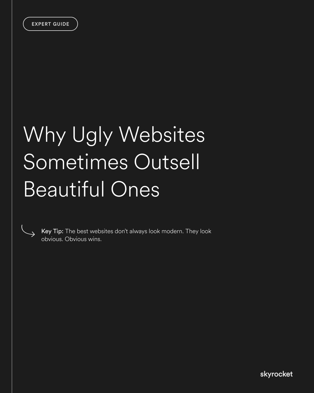
Key Tip: The best websites don’t always look modern. They look obvious. Obvious wins.
What “ugly but effective” actually looks like
These sites usually have at least 3 of the following traits:
1. Everything essential is above the fold
No scroll required to know what’s on offer, how it works, and what to do next.
2. Big, clear, specific CTAs
"Get a quote." "See pricing." "Book a call." Not "Learn more" or "Start your journey."
3. Copy that speaks directly to the buyer
No buzzwords. No brand poetry. Just clear, relevant language that shows you get their problem.
4. Trust signals front and centre
Testimonials, logos, guarantees, proof, not tucked in the footer.
5. Fast load times
Ugly sites are often lightweight. No autoplay videos, oversized fonts, or background effects slowing things down.
What beautiful but broken sites get wrong
1. Too much design, not enough direction
Animations, parallax, complex menus. It looks impressive, but leaves users unsure where to go.
2. Style over substance
Sites that focus on brand tone or aesthetics instead of answering key buyer questions: what is it, is it for me, can I trust it, how do I buy?
3. Unclear CTAs
Buttons like "Discover more" or "Explore services" don’t convert. They create hesitation.
4. Bloated pages
Huge hero sections, oversized fonts, excessive white space. They look “clean” but require too much scrolling to get to the point.
5. Too clever with copy
Trying to sound smart often hides what the customer actually needs to hear.
A better way to redesign
If you’re planning a new site, don’t start with design moodboards. Start with:
- Your sales goals — What actions matter most? Purchases? Enquiries? Bookings?
- Top user questions — What do customers need to know to buy confidently?
- Biggest drop-off points — Where are you losing people today?
- Fastest paths to value — What’s the shortest route from homepage to sale?
- What already works — Are there "ugly" pages outperforming your best-looking ones?
Objection: “But we still want it to look good.”
Of course. Great design can support clarity, confidence and trust.
But looks are not the goal. They’re the layer that should enhance function, not fight it.
The smartest sites blend both. But if you have to pick one, always choose clarity.
What to Do Now
- Review your highest-converting pages — What do they have in common? How do they differ from your lowest performers?
- Audit your homepage — Is it clear who it’s for, what you do, and what action to take?
- Rethink your CTA buttons — Are they specific and obvious, or vague and decorative?
- Speed test your site — Does anything slow, heavy or decorative need trimming?
- Ask real users — What felt clear? What felt confusing? What would they change?
Want help making your next redesign actually perform better? Drop us a line. We’ll be honest about what helps and what just looks nice.


